The control chart is a useful tool for tracking continuous improvement efforts and their impact on the process. We discuss how to apply process behaviour charts and interpret the data.
Lean, at its core, is about a deep respect for humanity and about visualising what is occurring in any given process. This allows us to expose waste and identify opportunities for improvement.
The Control Chart
One significant tool in the Lean arsenal is the control chart (or process behaviour chart). This is sometimes referred to as the Shewhart chart, or a Statistical Process Control (SPC) Chart.
It is one of several visual tools typically applied to quality control analysis. The chart enables us to understand how a process behaves and changes over time. Invented by Walter A Shewhart in the 1920s, control charts are used in numerous industries as part of continuous improvement methodologies.
Shewhart understood that no matter how well a process is designed there will always be variation within that process. SPC is an effective technique for variation monitoring and control.
Similarities Between the Process Behaviour Chart and Run Chart
A process behaviour chart is similar in many respects to the conventional run chart; it's really just an extension to it. A run chart plots observed values on the y-axis and the times they were observed on the x-axis. Run charts are similar to process behaviour charts but do not show the control limits of the process.
Interpreting Control Chart Data
When a process is stable and in control it displays natural variation - variation that is inherent in the process. A process is deemed to be in control when based on history it can be reliably predicted how the process will behave within limits moving forward.
Walter Shewhart made a critical distinction between the types of variation. Some variation is natural or routine, while other variation is exceptional and can be seen as a signal of a change happening in the process.
The Four States of Processes
Processes fall into one of four states:
The Ideal
The process is in statistical control and produces 100% conformance to customer expectations.
The Threshold
The process is in statistical control but still produces occasional non-conformance.
The Brink of Chaos
The process is not in statistical control but is not producing defects. It relies on good luck rather than good design.
The State of Chaos
The process is not in statistical control and produces unpredictable levels of non-conformance.
Every process will fall into one of these states at any given time. All processes will move toward the state of chaos over time.
Distinguishing the Process Behaviour Chart
A process behaviour chart creates a central line around the average of the data points. Where it differs from a run chart is that it adds upper and lower control limits (UCL and LCL). The control limits represent the normal distribution of data and signal exceptional variation when data points fall outside of them.
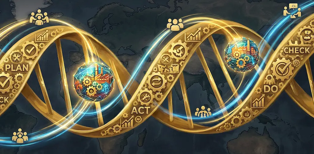
Consider Processes in Terms of the Greater C.I. Framework
When developing processes we must consider how they fit into the greater continuous improvement framework. The interconnection of Lean tools like standardised problem solving techniques, Standard Operating Procedures (SOPs), and a Tiered Daily Management process that supports the entire PDCA loop is critical.
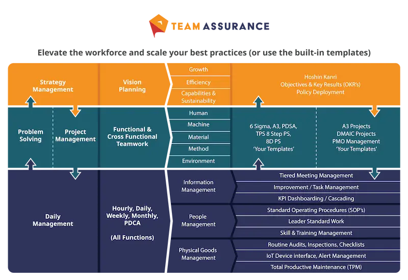
If you're a business in need (or a consultant with clients in need) and you'd like to explore the opportunities that digital-aids to Lean tools provide contact us for a demonstration of the TeamAssurance platform today.